Your cart is currently empty!

Painting a Lot with a Little
In this post, I am going to show you how to create a painting on your next vacation with only four colors. Vacation paintings are my favorite. Why? Because, having painted portraits for over thirty years, it’s a tough job. Portraits, they say, are the highest order of art. Why? Because everyone knows when a portrait isn’t quite right. As you can imagine, portrait unveilings can be quite stressful; the unveiling is either an incredible “IT’S AMAZING! THANK YOU!” …or… there is an awkward silence as the client tries to figure out what isn’t quite right. Every artist has had those moments.
John Singer Sargent, one of the greatest portrait artists of all time, remarked, “A portrait is a painting with something wrong with the mouth.” I’ve delivered portraits that thirty people saw and affirmed that I nailed the likeness, yet when the mother saw it, she did a head swag and said, “That’s not my daughter.” The culprit? One of the eyes was off; even the father didn’t recognize it. The daughter used to have a lazy eye and the mother insisted the eyes were off. I asked for time to make an adjustment. Left alone, I lowered one eyelid 1/64th of an inch. I invited the mother in to review. Her response? Tears of joy. “Now, that’s my little girl!”
I also paint landscapes. Compared to portraits, landscape painting is candy. No one tells me the tree or the rock is wrong. It’s like having dessert without the calories. Look at the beauty, respond with paint upon your canvas!
However, as my retinas have continued their lifelong decline (I am down to my last half of a percent of working retina), my color sense has shifted. Also, my ability to discern detail in either deep shadow or bright sunlight has diminished. Still, nature is beautiful. I love the effect of the bright yellow sunlight upon the land. Sunlight makes me happy, be it its warmth upon me or its blazing, impartial gift of light upon a world that would otherwise be dark.
Painting for me is responding. I respond to the life that nature portrays. Everything from the tiniest shoot of wildflower to the towering firs reaches for the sun. Branches of our garden tomatoes and branches of our old maple reach in earnest to gather more sunlight to grow, in itself a marvelous thing.
One of my favorite landscape painters is Winslow Homer. I love his watercolors of his journey down to the Caribbean. In this post, I will share a painting I did that was inspired by one of his Caribbean forays. I will also show you my materials and technique in case you would like to give it a whirl yourself.
For this demo, I am using gouche paint. It has the dependability of acrylic and the flexibility of watercolor in that you can remix dry colors. Follow the photos below for a step-by-step example of how you can create your own little heirloom on your next getaway.
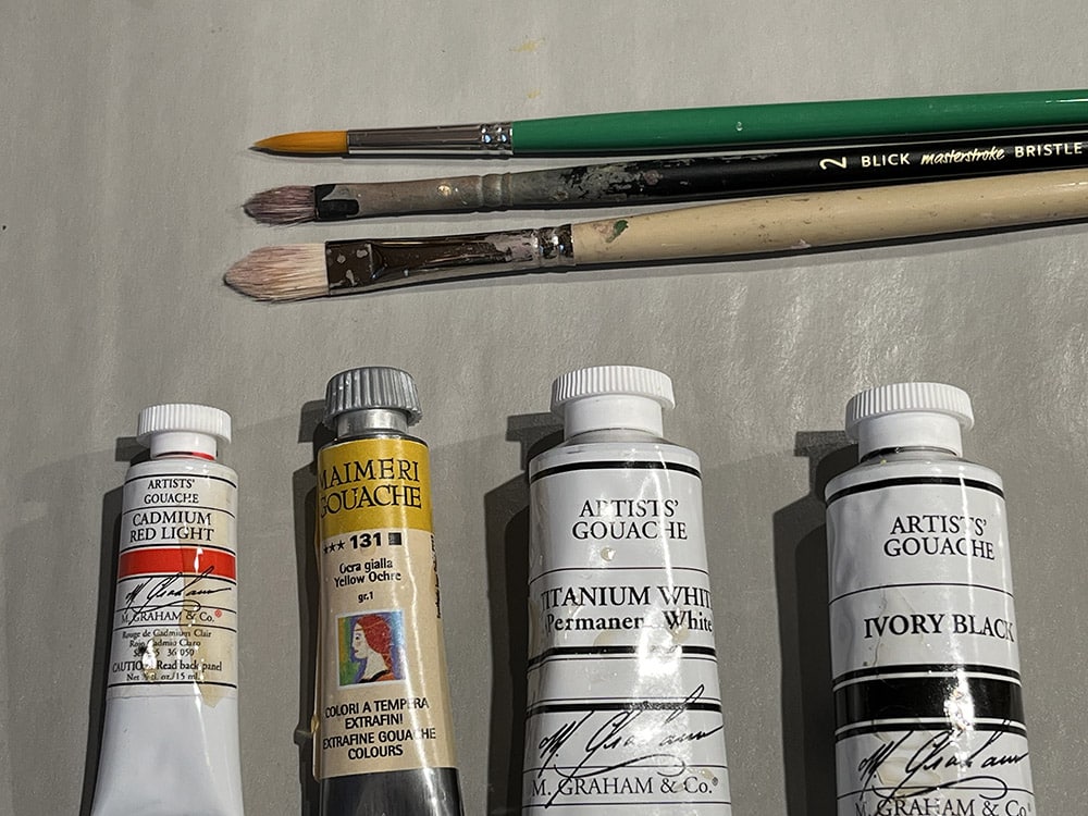
For this painting, I am using four colors: white, black, yellow ochre, and cadmium red light. I may also use a bright blue if needed for the beach umbrellas, but we’ll see. I brought three artist brushes: two have filbert style tips and the third has a round tip for detail if needed.
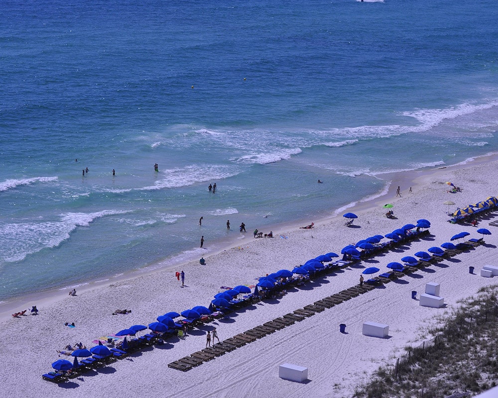
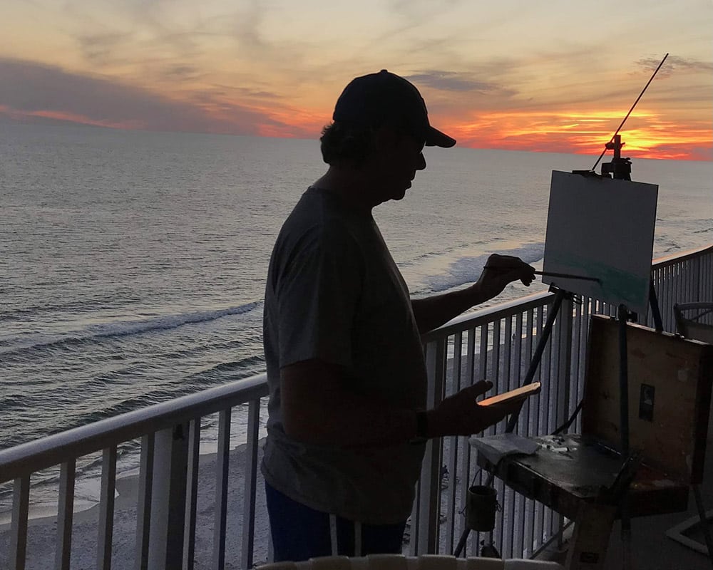
I will be painting the scene from the eighth-floor deck of our beach rental. Keep in mind that an artist reserves the right to paint whatever he or she wants. Just because something is there doesn’t mean you have to include it in your painting! Do I have to paint every beach chair and umbrella? Ha, no. I am mostly enthralled with the sense of space and the feel of the ocean- the salty air, the breeze, the energy of the waves thundering to shore, the clear sky. With my vision, I cannot see details, so I will aim to get the gyst of what I see and feel. It’s my (or your) painting… paint what inspires you.
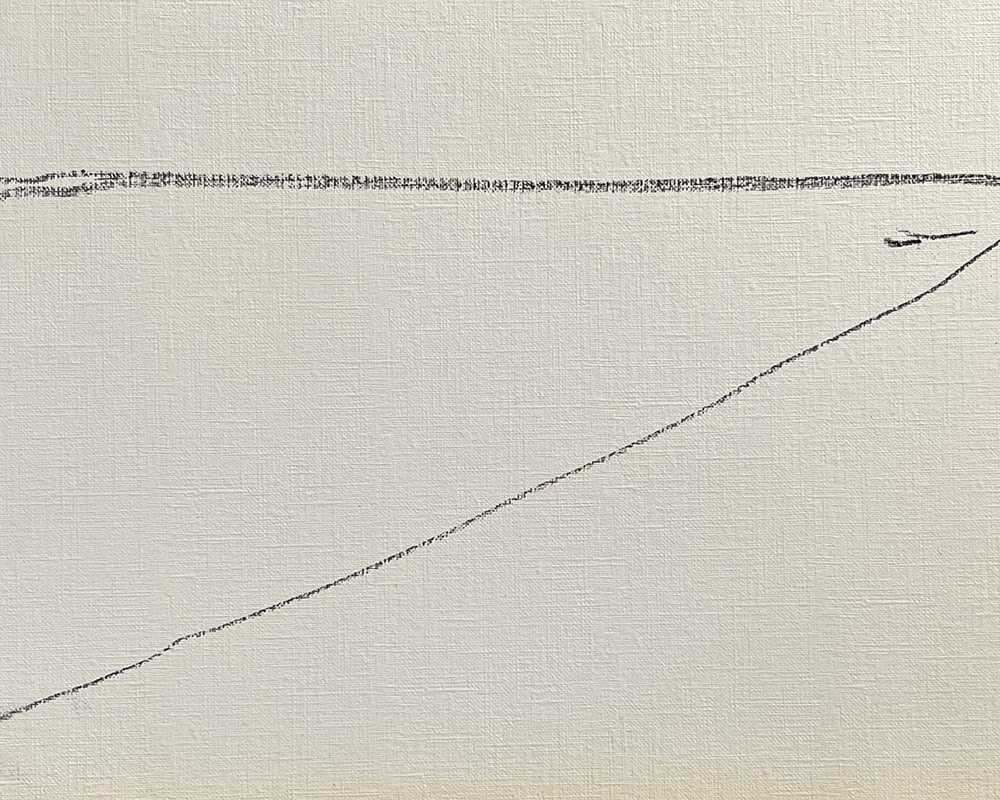
I start by drawing a few simple lines to establish where the big things- the big shapes- are. Start a painting with the big idea… in this case we have 1) the sky, 2) the ocean, and 3) the shore. I make a few lines to show where these are. Try and get the angle of each thing (the horizon is straight and level, the shoreline is at an obtuse angle. You can use pencil or my favorite, vine charcoal (it’s soft, erases easily. Available at any art store).
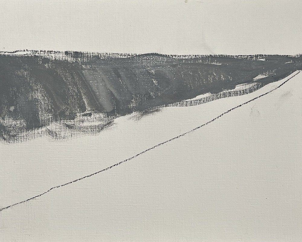
I mix a bit of white paint with the black paint to come up with a bluish gray for the sea. I quickly cover the area that is the ocean in the painting. Make a guess how light or dark the sea appears to you, match the mix on your palette (which, by the way, can be a disposable plate, plastic wrap stretched across something firm, tin foil…), and then lay a generous layer of paint on your canvas for the sea!
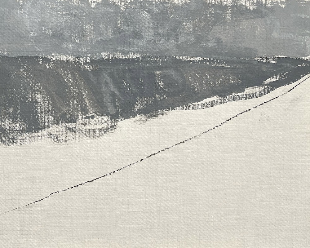
I mix up more white and black, but a lighter shade than the sea below, for the sky looks lighter and brighter than the sea to me. Be generous, and don’t worry about making everything perfect. You will be able to go back and lighten or darken things as you proceed. Right now, we are simply putting down our best guesses for the closest color and lightness/darkness of each aea of our painting. We are having fun! By the way, if you want to rekindle that freedom you miss from kindergarten and paint with your fingers, go for it.
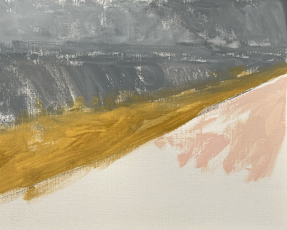
Now comes the shoreline! I brush yellow ochre color where the sea meets the land and turns the sand a rich yellowish-brown to my eyes.

This is where my eyes may see entirely different than your eyes or my wife’s eyes. I see the beach as a soft, light pink where the sun hits the sand. I brush a generous mix of white and cadmium red light (just a touch of red…not too much!) for the bright beach sand. Remember, there are no rules to follow. Paint whatever you wish! Also remember that this is paint- you can always paint over what doesn’t work. Too dark? Repaint it lighter! Too light? Paint it darker? Too blue? Add some yellow or red into the mix. Feel free to experiment!
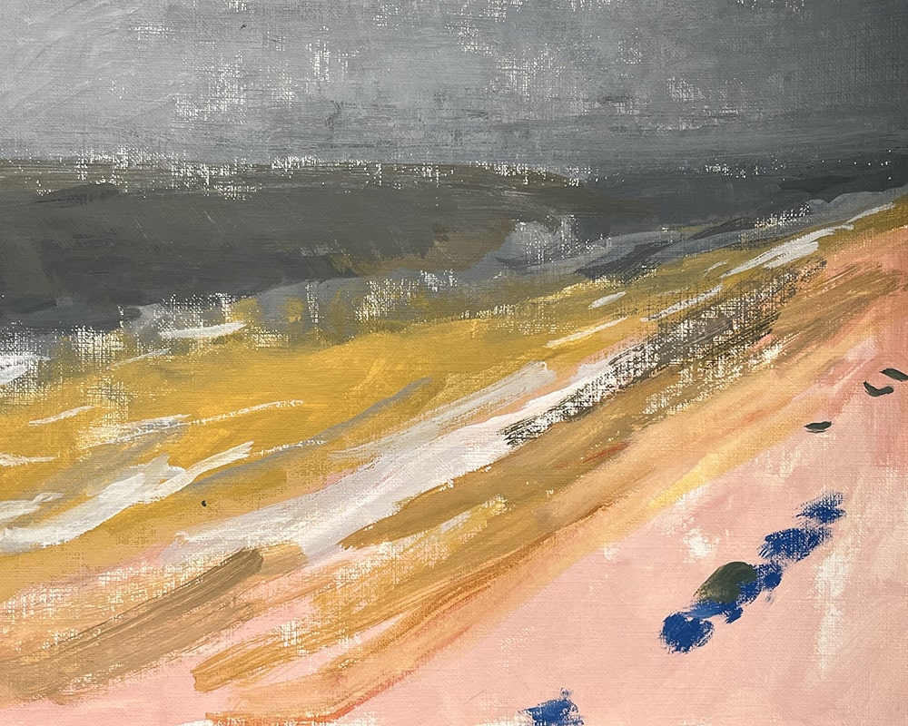
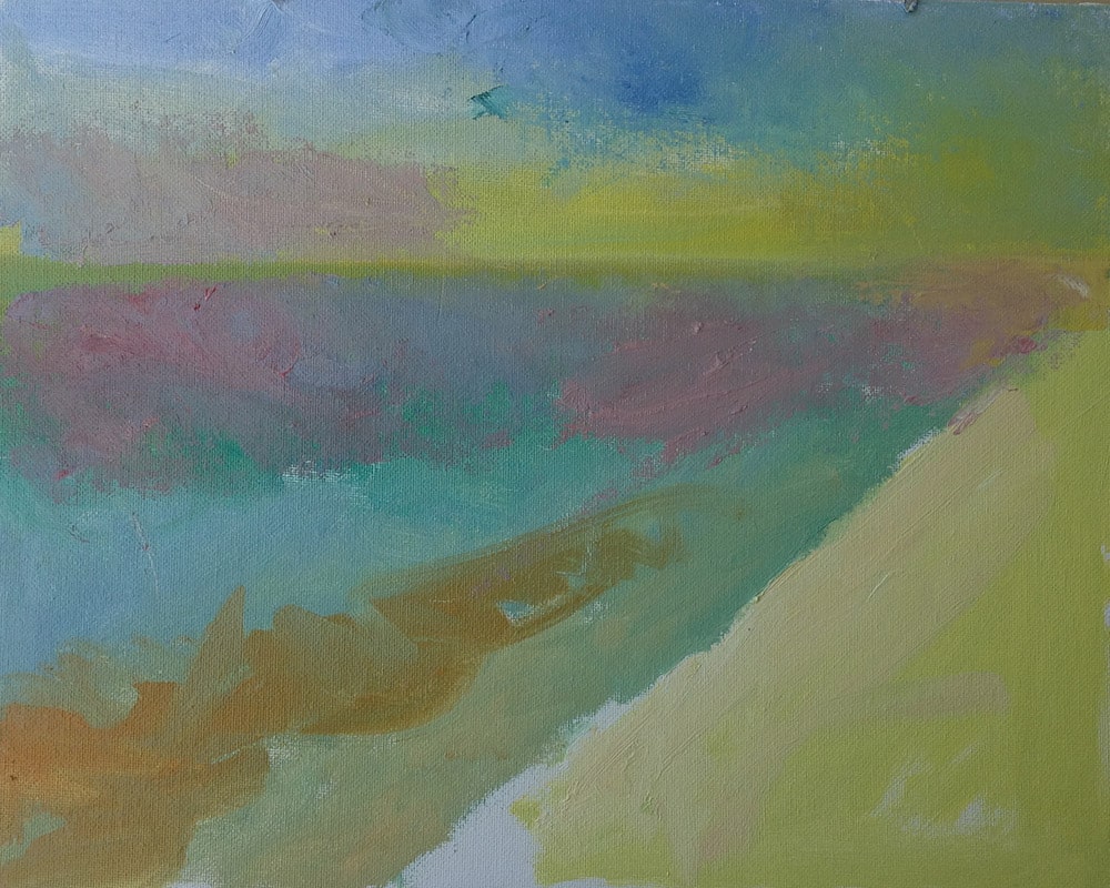
I begin to add straight-up white paint where I see the waves at the shore. I also make little brushstrokes where I see the beach chairs and umbrellas. I am estimating all the time. If I am wrong, no worries. I try again and then paint over the wrong guesses. You’re having fun! There is only one grade here- an “A” for having relaxing and having fun.
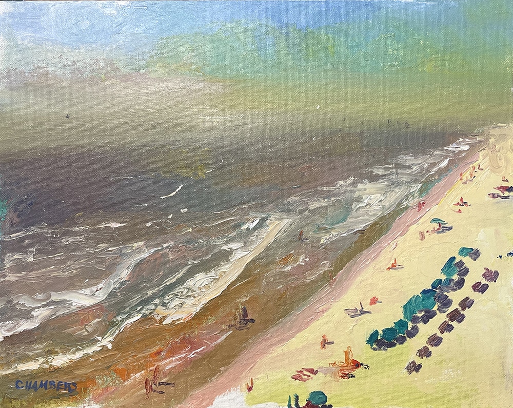
I corrected a few things that didn’t quite look right to me (I may ask for a second opinion now and then, but I have learned not to paint to please other people; when I do so I become a technician painting their ideas rather than having fun painting what I see and feel). I like how this painting turned out. It’s a favorite reminder of a wonderful vacation! And I believe it’s much more fun and meaningful than a photo on my phone or even a print. It has “fun” painted into it!