Block Studies – A Great Tool for Growth
The Fundamentals to build realistic painting skills
Learn how to use color value to generate still-life paintings
Doing block studies is a terrific way to develop your drawing, value, color, and painting skills. They are easy to acquire, take little time to set up, and yet they yield great dividends in terms of your artistic growth. Here’s a quick guide to help you get movin’ and growin’.
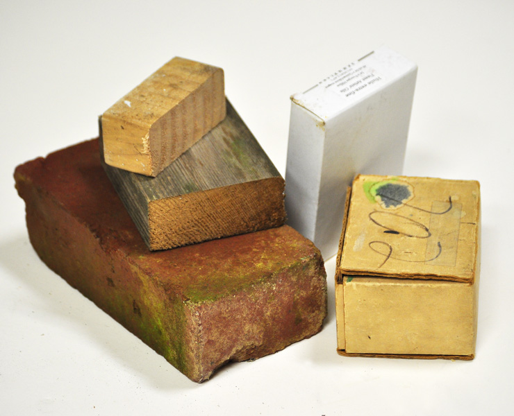
1. Gather a few blocks. You can use cut pieces of wood, bricks, small boxes- whatever! I cut scraps of lumber (2×4’s, 2×6’s, 4×4’s, etc.) into short lengths of 4-7″ each. I also found some small cardboard boxes (the kind that you might ship jewelry, watches, paint tubes, or little trinkets in) that are a good size. You might also have a brick or two around the home that you can use. The idea is to find something that has clean, square, plain (no patterns/designs) sides.
2. I painted the blocks in different shades and colors to provide a variety in my block studies. Over time I’ve created a small collection to choose from. You don’t need this many to start painting! Just a few- perhaps a half dozen- will be enough to have fun. Start with white, black, and a few bold colors such as the primaries (red, yellow, blue) and/or secondaries (green, orange, violet). 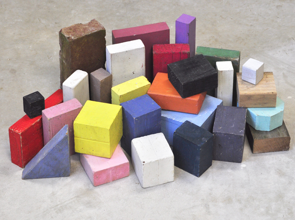
3. Arrange a few blocks on a table top in a way that is pleasing to your eye. Nothing fancy, mind you. The idea is to keep things simple, as the focus on seeing the planes, values, and colors (if you’re painting) accurately. You can paint indoors or out, under a strong light or a soft one, under bright sun or cloudy skies. Just make sure you can see a distinction between the planes (sides) of the blocks. You can lay a ‘tablecloth’ down for interest. Whether it’s a smooth counter top, weathered picnic table, or fabric, just keep it simple.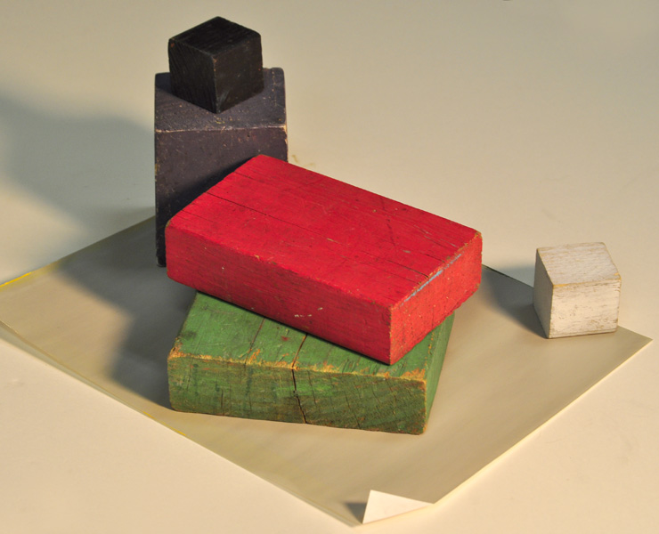
4. Sketch. As you draw, pay attention to the angles of each block. How does the angle of one edge of a block compare to a vertical (plumb) or horizontal (level) line? Where is the placement of one corner of a block relative to the other blocks? How close are they? Is there a lot of space between a block’s edge or corner to the next block or table edge? Asking these questions and comparing the answers to your drawing will yield increased accuracy in your eye for drawing. Sketch your drawing very lightly- even lighter than the example below.
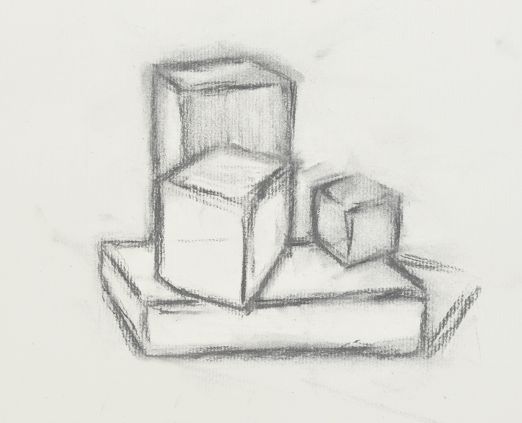 student drawing
5. Values. That’s the lightness/darkness of a plane. A block has 6 planes, though you can only see 3 at any given moment. Often, a change in plane equals a change in value. What is the lightest value in your still-life setup? What is the darkest value? Note these on your drawing/painting, then gradually note the values in between the lightest and darkest values. Don’t forget the cast shadows; treat these as their own masses (e.g. shapes), and compare them to the planes of the blocks and table top.
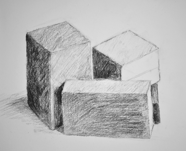 student drawing
6. Color. Trickiest part of this exercise, but I definitely the most fun. Charles Hawthorne, and my former teacher, Henry Hensche, who both taught at the famed Cape School of Art in Provincetown, Mass., taught us to look at color as ‘spots’ or ‘notes’. Essentially, you reduce what you’re looking at to merely a composition of various spots of color. Just as you do with values, you compare one against another. A good habit is to paint a small spot of color, perhaps about the size of a quarter, for each plane in your painting. Put down as raw, or pure a color as you can; in other words, try and use a color straight off your palette with no mixing/modifying of the color. Then, once you’ve got these spots down for every plane and shape in your painting, then you begin to compare and refine (revise) them. Once the quarter-sized spots are in right relation to one another, only then do you begin to fill in each plane.
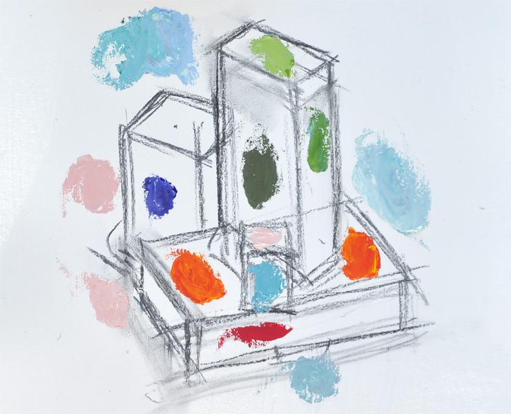
7. Finish. Once you’ve established the correct relationships of color and value, then go to finish. Henry Hensche taught me (by example) not to paint all the way up to the edge of each plane until I was ready to finish. As a result the painting looked like it had white outlines around each plane until it was near completion. The reason? It allows one to adjust the color within each plane without touching (accidentally!) the colors from an adjacent plane, thus keeping the colors pure and clean rather than muddying up.
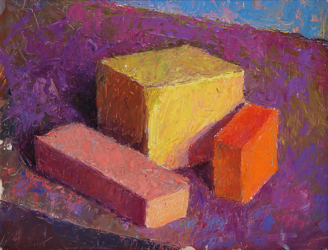 Blocks on an Overcast Day in Provincetown by Timothy Chambers


